We live in a data-driven world, always chasing increases in leads, conversion, sales, registrations. Conversion rate optimization (CRO) has become a common piece of the marketing lexicon. We agonize over minute changes, because we know that they can yield big business results.
If you sell anything online, from shoes to audio editing software, you know how important CRO is. So what are some ways that your company can consistently improve your online conversion rates? Here are three best practices that can have a big impact on your results.
Factor in the Perceived Cost of Your Cart
The perceived cost of your e-commerce website’s cart = the price on-screen + other mental pain points. Any on-screen component that provokes resistance in the mind of a shopper has the same effect as increasing the price shown on the screen.
There are three particular factors that increase perceived cost: friction, anxiety and mental labor.
Friction
| Elements that introduce Friction | Potential Solutions |
| High shipping costs that aren’t revealed until late in the checkout process | Offer free shipping or have shipping prices listed clearly on the site |
| Having to register and create an account before completing the purchasing process | A “guest checkout” option with registration not required |
| Extra fields in forms that are unnecessary | Only show necessary fields, remove the rest |
Anxiety
One of the most common causes of anxiety? A visually stripped down, bare-boned credit card form.
When customers see a CC form with the typical Minimalistic visual design that has become so popular, it makes them uneasy. There isn’t a perceived sense of security. Although that Minimalistic design works wonderfully well in all other points of UX, not so much for the CC form.
Instead, encapsulate the credit card fields. Studies have shown that layers of visual content surrounding the CC fields create a sense of protection. Also, add third-party seals that confirm your site is trustworthy.
Mental Labor
If your site gives customers too many choices in the cart process, you might have a problem. The perception of infinite choice causes paralysis.
One study revealed that removing the website’s usual left navigation from the checkout page increased the completion rate 10%. Removing the top navigation increased completion rate by 19%!
Keep the Law of Proximity in Mind
Gestalt psychology – which “tries to understand the laws of our ability to acquire and maintain meaningful perceptions in an apparently chaotic world” – has become extremely useful for conversion-focused marketers.
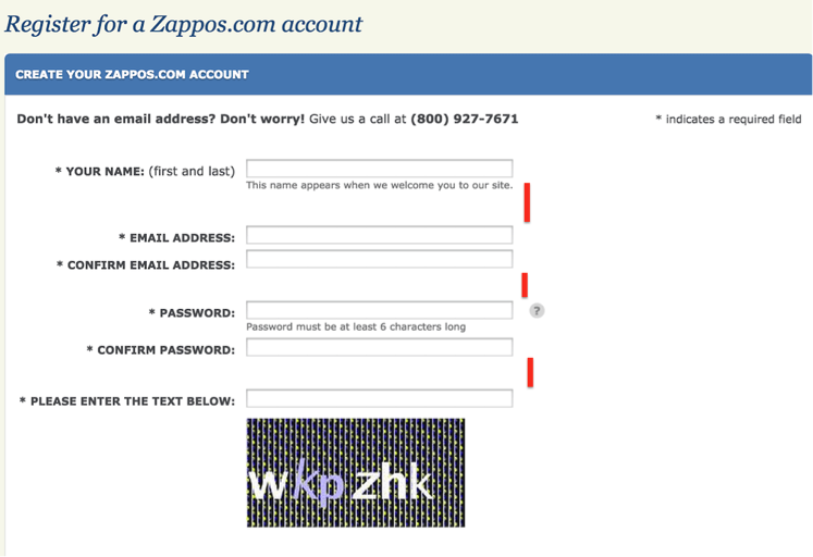
Zappos provides an interesting example of how marketing uses the “Law of Proximity.” They do something astonishingly simple – on their registration form they group the email fields closer together than any other fields.
The brain immediately draws a connecting line between the two fields clustered together, and it makes it easier for the eyes to find a sense of orientation as it scans the form. This subtle improvement to the registration experience improves the user’s experience, which in turn improves the company’s registration rate.
Follow the Process
Finally, the most important habit for improving your conversion rate? Follow Jon Correll’s advice: Follow the process, not the result.
The very popular and useful site WhichTestWon.com gave him a perfect example. One shared test on the site yielded a jaw-dropping 972% conversion rate increase. However, as Correll noted, when you try to replicate these tests, it’s difficult to achieve the same increase percentage. It can be frustrating to the point that it disrupts your work and lowers the morale of your team.
Instead, Correll offers this sage advice:
“If you’re tasked to make changes and run tests, and then show those results to people [i.e. your boss] with unrealistic expectations, you’re not going to be successful, as failure is part of the process. You need to embrace failure and love learning.”
Need some help boosting your website conversion rates? We’d love to help. Just drop us a line!

