Can you think of something better than more sales? Neither can we.
And yet, one of the most important conversion points for Software-as-a-Service companies, your pricing page, might not be getting the attention it deserves.
It can be tempting to model a page after another company’s without thinking through how the design will work for your unique product. However, if you take the time to design a custom page, you’ll better position yourself to receive the sales your product deserves.
A well-designed SaaS pricing page is not only nice to look at, but it also results in more conversions. Here’s how to design a pricing page that converts.
Great design + product marketing
A successful pricing strategy is part product marketing and part design. The most well-designed pricing page can’t save a poorly thought-our pricing strategy. Here are some of the unique factors that SaaS pricing includes.
- Monthly subscription models. Unlike an eCommerce shop that charges for each physical product, SaaS companies offer subscription models. Most companies offer monthly subscriptions, with the option to get a yearly subscription for a discounted price.
- Ability to endlessly A/B test. You don’t have hundreds or thousands of product pages to account for if you want to test a new layout or presentation, just one conversion point. SaaS companies can endlessly A/B test pricing pages in order to optimize conversion rate much faster than other business models.
- Present for customer value. Especially when it comes to multiple tiers, prices need to represent how much customers value the product. This is why it’s essential for SaaS companies to design websites that showcase the product’s benefits.
When designing a pricing page, you’ll need to make sure your marketing, product managers, and company leaders are on the same page. It’s not only a question of the design of the page, but also the pricing structure itself.
Showcase benefits & features
If you want conversions, your pricing page should show how much value your services add. Benefits and features should be showcased, so that website visitors are compelled to spend money on more expensive packages.
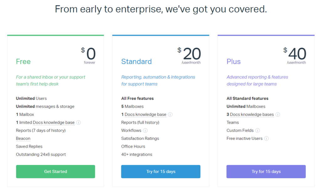
For example, Help Scout offers three packages, listing the features on the pricing page. When comparing their options, visitors understand exactly what they’ll receive when they sign up.
Prospects can compare the Free plan to the Standard one, which gives them an understanding of how much they’ll gain by upgrading to the Standard plan.
In order to show off benefits and features, you can:
- Show options side-by-side in two or three tiers and mention that the plan includes “everything the [previous tier] has PLUS…”
- Use checklists to show what each pricing package includes (like Rafflecopter’s “Plan Breakdown”)
- Use successively longer or shorter feature lists to show how much more a customer will receive with an upgraded plan (a la SumoMe)
End prices with 9
Ending your prices with the number 9 is one of the oldest tricks to increase conversion. It may sounds corny, but this strategy works.
According to research published in Quantitative Marketing and Economics, prices that end in 9 are often able to outsell more than lower prices for a product. Basically, if a visitor sees a price that ends in a 9, such as $24.99 or $39, they’ll be more likely to sign up.
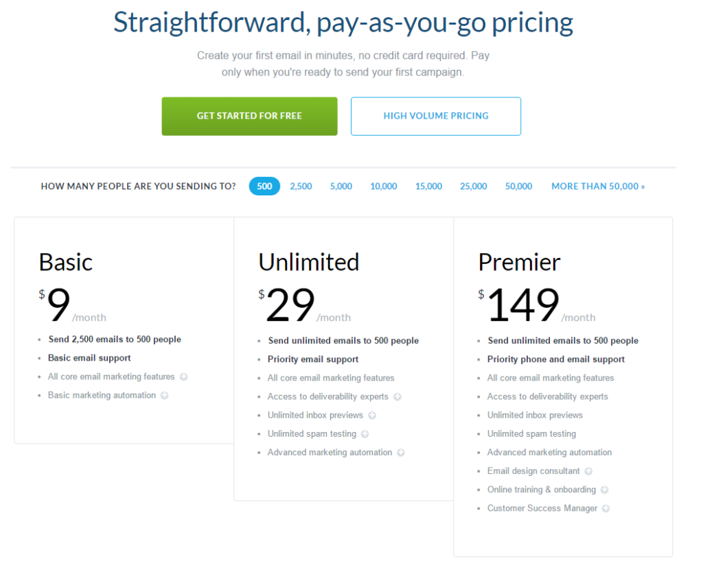
Campaign Monitor could sell their tiers for $10, $30 and $150. But if the smart folks over there used the “end with 9” pricing trick, maybe there’s something to it?
If you want to increase conversions on your price page, dress up those packages “to the nines”! (Sorry, we’ll see ourselves out.)
Anchor your prices
Many have found that anchoring product prices is an effective strategy. Anchoring is when you set visitor expectations by showing different prices. For example, a $15,000 may seem expensive until it is put next to a $50,000 car.

This isn’t just an idea– it’s actually been proven by psychology. In a study conducted at the University of Missouri, researchers found that when people were given real estate pamphlets with artificially inflated prices, they were more likely to overestimate values of homes.
But how does this work in practice as you design a pricing page? When you design your page, you can place a “most popular” package– the one you want customers to go for– alongside a much more expensive package. When visitors see these packages together, the “most popular” package will seem like a much better deal.
In order to guide the eye to a particular pricing package, you can:
- Enlarge fonts or overall package (Which Grasshopper plan stands out?)
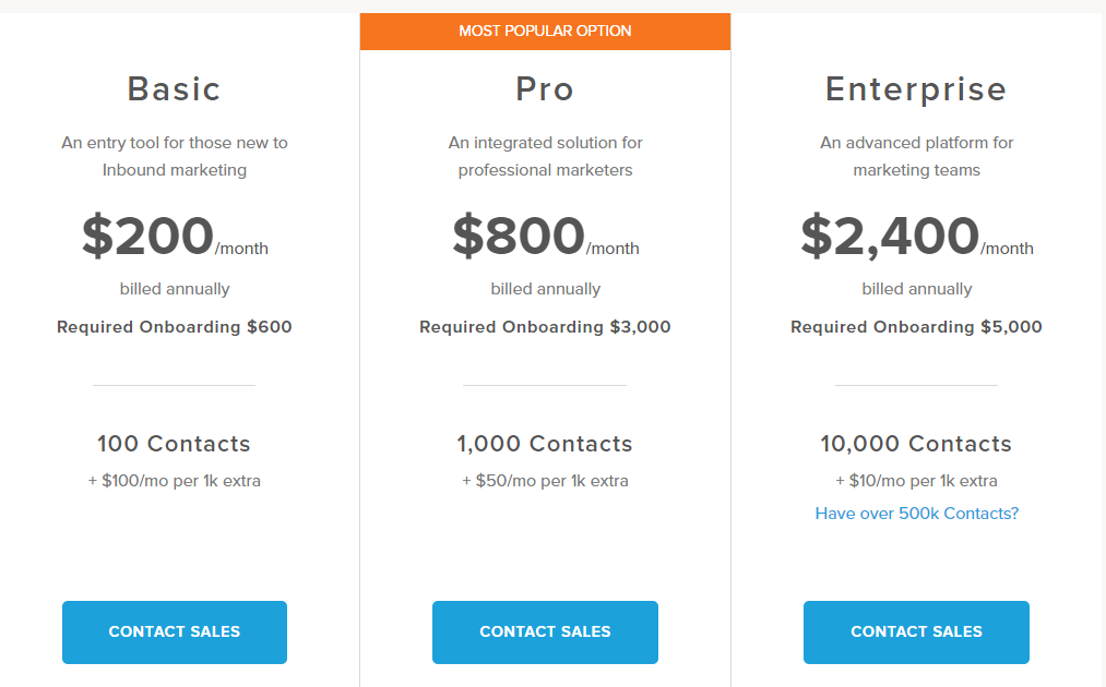
- Highlight a package with colors that pop (Like that classic HubSpot orange)
- Create a banner that reads “most popular” or “recommended” (Move the slider on MailChimp’s pricing page)
- Showcase a certain package on top of page (Groove’s pricing page is a great example)
Split test until you drop
Every company is different, and there isn’t a perfect formula that will work for every SaaS pricing page. Some companies find that three tiers is the magic number, while others find that offering four works much better. Others offer prices on a sliding scale, charging per user.
The only way to know what will work for your company is through split testing. A/B testing tools allow you to test different elements of your pricing page to see what will increase conversions.

Here are some of the most common elements that SaaS companies split test:
- Number of pricing packages
- Page length
- On-page imagery
- Product prices
- Button colors
- Copy of call-to-action
- General pricing page copy
- Effect of showing a “most popular” or “recommended” price
- Effects of raising prices
Wrapping up
Many of your marketing efforts – such as creating promotional emails, educational content, and a paid advertising plan – bring people to your pricing page.
But what happens when they arrive? They land on your pricing page, of course.
If you work in marketing at a SaaS company, there’s nothing that’s better than more leads and sales. In order to get the results you desire, you should devote some attention to increasing the conversion rate of your pricing page.
Remember, every company is different, offering a unique value proposition to customers. Your pricing page shouldn’t be a duplicate of a competitor’s. At the end of the day, you need to build a page that works for your unique SaaS company.


