Your website works hard to pique interest, inform users, and ultimately drive them to connect with your business. The sign up or registration flow may be the first conversion interaction with your business, and has the potential to make a big first impression. Streamlining this flow will improve the visitor’s impression of your company and turn qualified visitors into qualified prospects or customers.
Here are several ways to improve your sign up flow and make it as intuitive as possible.
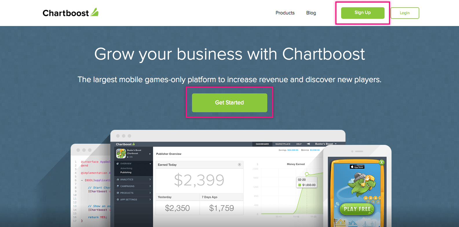
Boost your CTA
The first step in the conversion process is intriguing them enough to hit the sign up button. Quickly letting the user know what you do, the value you bring, and why they need you will drive them to sign up.
Put yourself in your customer’s shoes and draw them in with your insight. Personalizing the call-to-action (CTA) button’s copy has shown to significantly increase the CTR. In a test by Unbounce, changing one word from You to My increased CTR by 90%!
A prominent/persistent call to action is key in capturing the user’s information. Placing the CTA in the main navigation or footer is a great way to ensure visibility across the site.
Using a bold visual treatment (color, size, shape, placement, verbiage) that stands out on the page will draw the user’s eye and capture their attention. Within your site’s UI, try to choose a bold color that stands out and clearly communicates an actionable button.
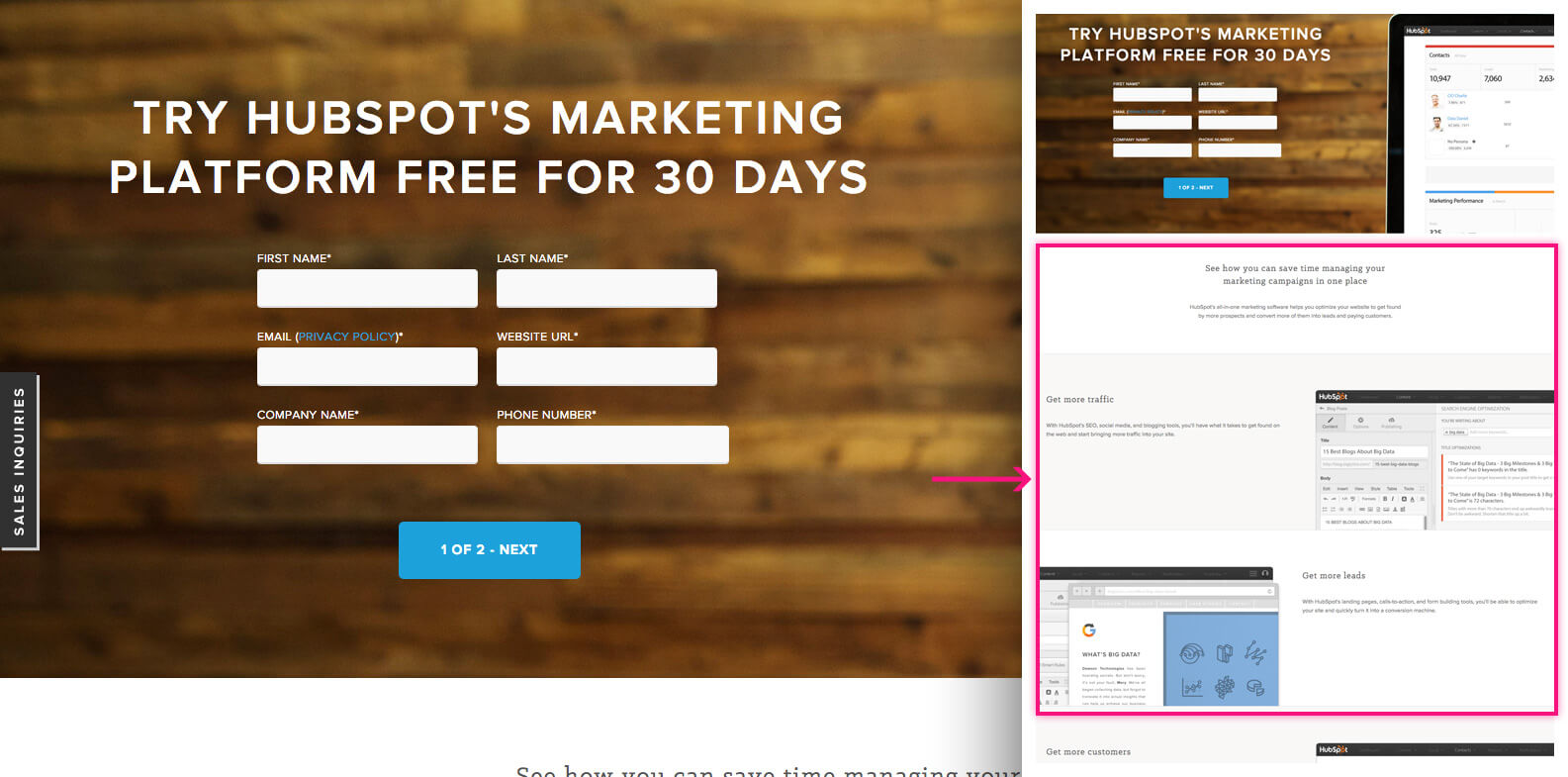
What questions are your customers asking?
Take time to understand your customer’s pain points and how you serve them. Think about the issues or needs they have when coming to your site and answer those up front.
Educating the user is key to a initiating their interest and commitment to your site. Leveraging use cases, ongoing resources, blog posts, and the voice of your site will ultimately drive them to start the sign up flow.
Tips for an easy sign up
You’ve done it!! You’ve wowed them and they’re ready to start using your product…well, almost. Now, the final step to capturing the user’s core information to create an account.
The most important factor in creating an easy registration flow is removing any friction. Friction means areas or features that distract from an easy sign up. A study by Forrester Research stated that “11% of US adults have previously abandoned an online purchase either because they didn’t want to register online or the site they were visiting was asking for too much information.”
Keep it simple
There’s a balance to be hit for the amount of forms, number of required items, and showing the right/necessary information up front.
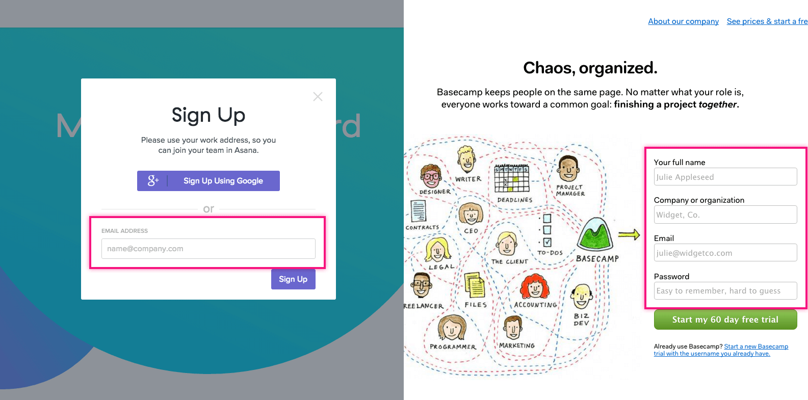
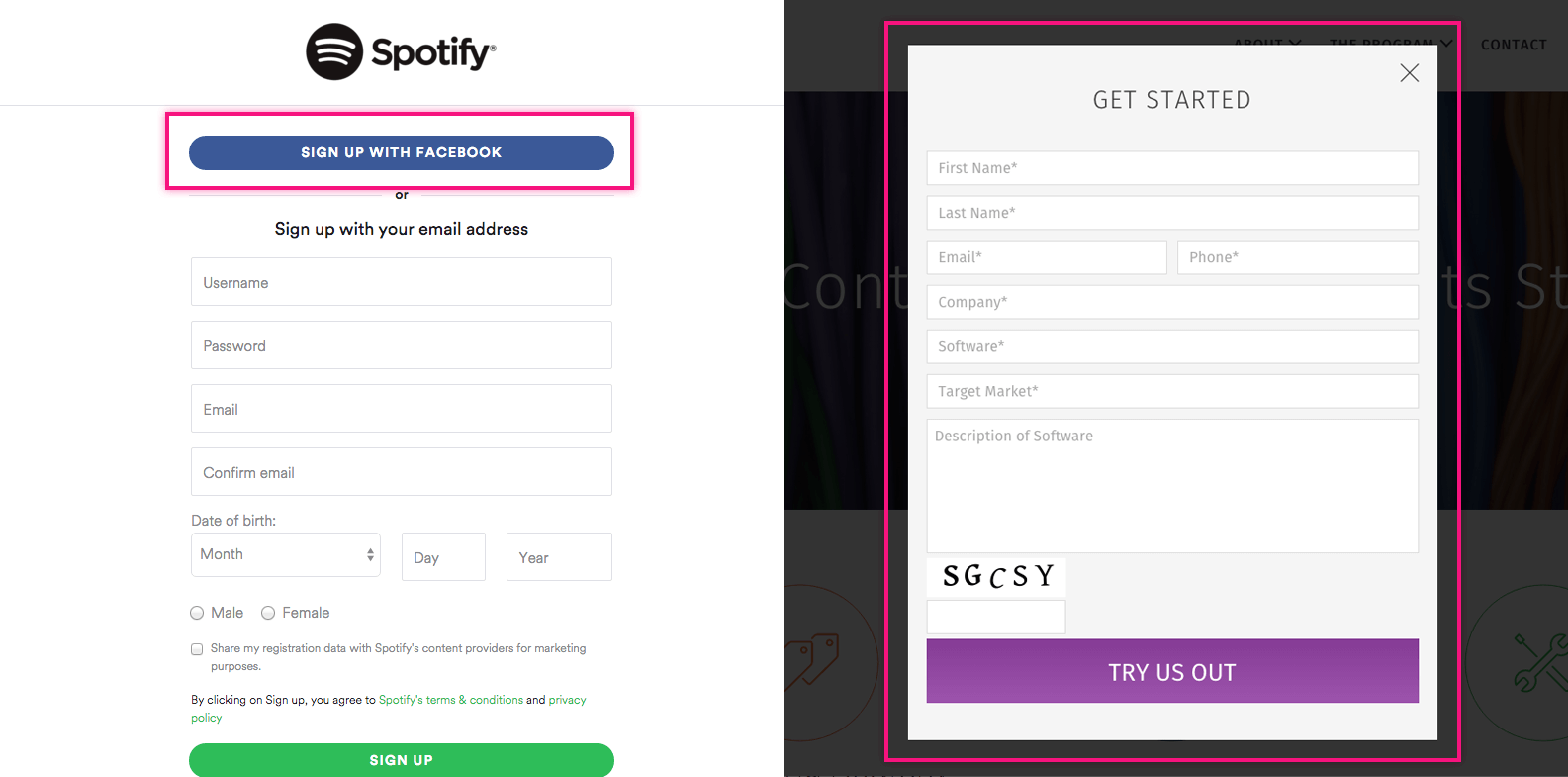
- Limit fields to only required information. This increases a visitor’s willingness to sign up and ability to create a valid account. For most B2B businesses, these fields are: name, company, email, password.
- Requiring only an email address may convert well for quick registration, but it creates a longer process to complete the account. The user is forced to confirm the email notification to complete the process. However, showing too many fields at once creates a higher barrier to entry for the user and results in a higher exit rate.
- Limit elements outside of the sign up area to make it clear that there’s one thing to do here – sign up.
Guide Users
Every site will have different needs for required information, but being able to guide users through the process is an effective way to make it easy.
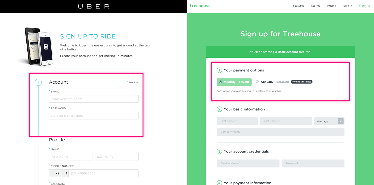
- For longer sign up processes, break the flow into steps. This makes it more digestible and enticing for users to complete. It also allows them to make edits, changes, and track progress.
- A short guided tour works well to hit the key features. If your product is complex, it’s worth requiring a few more clicks to be sure prospects completely understand what they’ll get. A feature like this should optional to the user. Letting them skip the tour covers a wider range of user types and levels of commitment.
- Clearly informing the user on the type of data a field requires will reduce any misunderstanding and errors. This could be handled by using tooltip hints, label hint text, or real time validation/error states.
- Here’s a simple fix: to reduce clicks, make the first form active so the user can instantly start typing.
Entice Users
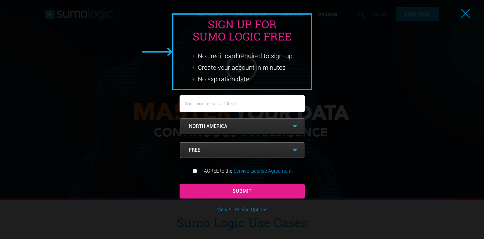
- On the sign up screen, list a quick preview of key benefits or what they’ll be getting. This could a short list of key features, product screens, or ways you help your customers. Keeping it short and sweet will let them scan this while they’re signing up.
- Showcase successful clients to instill a sense of trust in the user. Social proof is a quick way to build credibility by demonstrating that these customers rely on you.
- People connect to other people. Including an image of a happy, authentic person builds a human connection to the brand. The user isn’t just interacting with a company, but with real people.
- Reassure users that their data is secure and they won’t be getting any spam. The addition of a lock icon gives a sense of safety, as does showcasing the technology you use for security, like Norton or TrustE.
Streamline the flow
What can you do with an extra 5 minutes? Multi-tasking has reached new heights, and an extra 5 minutes is so valuable in our busy days. Saving your customers time sets a good first impression and gets them using your product faster.
- Offering users the ability register through a social login gives them the option to save time and reduce the number of unique username/passwords to keep track of. Social login has proven to double the sign up speed.
- Open the sign up flow in a lightbox to keep users engaged with the site after they’ve registered. Rather than derailing their experience, it elevates what what they were doing through personalization. Displaying content in a lightbox adds a unique/modern layer to the site’s UX and is scalable for smaller displays.
- Test the approach with different audiences. User testing is so valuable and creates metric-driven decisions. At UpTrending, we use HotJar to pinpoint how users are engaging and highlight areas where they get stuck. This insight helps us improve the sign up flow and make adjustments when needed.
Conclusion
An intuitive sign up flow is the first step in your relationship with customers. Putting the customer’s needs first and following these recommendations has proven to significantly increase conversion rate and customer engagement.
What other tips and techniques have you seen to make sign up flows more intuitive? Drop us a line on Facebook or Twitter. We’d love to hear what’s working for you!